.png)

TL;DR:
- UX optimization is a systematic process focused on removing friction and building trust to increase revenue.
- Continuous A/B testing and iteration lead to compounding improvements in conversions and customer loyalty.
- Treating UX as a long-term, data-driven strategy prevents stagnation and drives sustained growth.
Most e-commerce brands treat user experience (UX) as a design problem. Pick better fonts, clean up the layout, maybe add a hero image. But that framing costs you real money. UX optimization is actually a revenue engine, a systematic process of removing friction, building trust, and guiding customers toward a purchase decision. For DTC brands especially, getting UX right means more than prettier pages. It means owning your customer data, building loyalty that doesn’t depend on a retailer’s algorithm, and compounding conversion gains month over month. This article breaks down what UX optimization really involves, what the data says about its impact, and how to build a process that keeps improving.
| Point | Details |
|---|---|
| UX goes beyond design | Optimizing user experience is a systematic, test-driven process with tangible business impact. |
| Small changes drive big results | Simple UX tweaks like sticky CTAs can instantly boost conversions and loyalty. |
| Iterate, don’t guess | Consistent A/B testing and data analysis outperform one-off redesigns for sustained growth. |
| Avoid common pitfalls | Blindly copying trends or adding features can backfire—test every change in your own context. |
UX optimization is not about making your site look good. It is about making it work better for the person trying to buy something. The two goals overlap sometimes, but they are not the same thing, and confusing them is one of the most expensive mistakes a growing brand can make.
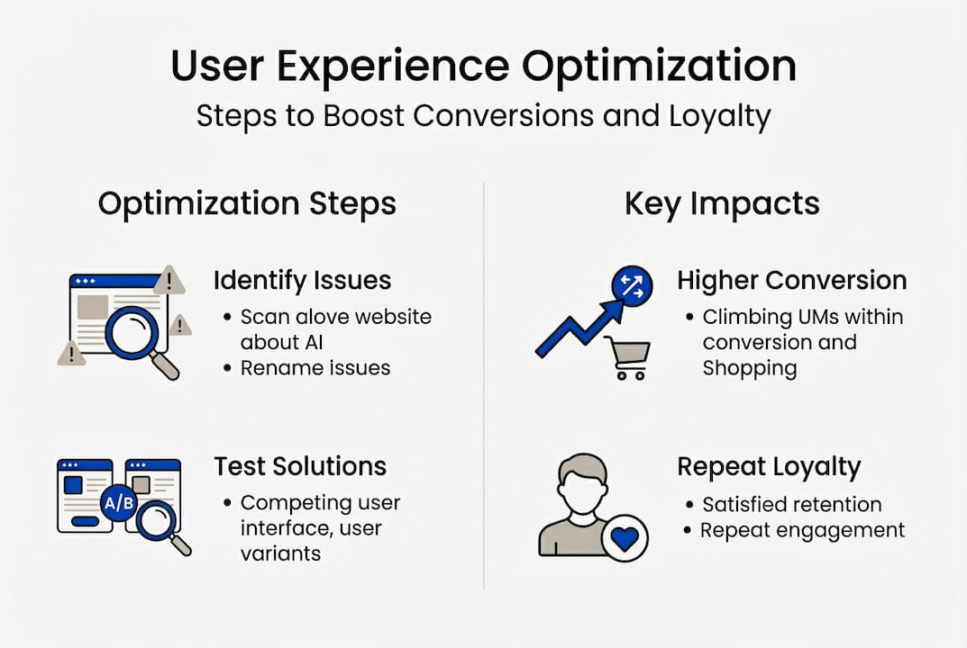
At its core, UX optimization covers four pillars:
For DTC brands, that last pillar matters more than most people realize. When you sell through Amazon or a third-party retailer, you lose visibility into how customers actually behave. Owning your UX means owning that insight. You can track where people drop off, what copy they respond to, and which layouts drive repeat purchases. That data compounds into a real competitive advantage.
“UX optimization is a systematic CRO process, not just a design exercise. It requires structured testing, behavioral analysis, and iterative improvement to drive measurable business outcomes.”
This distinction matters because it changes how you resource UX work. If UX is just design, you hire a designer and move on. If UX is a conversion rate optimization (CRO) process, you build a testing culture, you measure outcomes, and you treat every page element as a hypothesis.
The practical implication: increasing conversion rates through UX is not a one-time project. It is an ongoing function. Brands that treat it as such consistently outperform those that launch a redesign and call it done. And when you pair strong UX fundamentals with disciplined ad testing strategies, you close the loop between what gets people to click and what gets them to buy.
Let’s talk numbers. One of the most instructive real-world examples comes from a deep analysis of 36 A/B tests run on an e-commerce site, where 5% CVR lift was achieved through incremental UX changes, not a full redesign. Sticky call-to-action (CTA) buttons alone produced conversion lifts between 18% and 32% depending on placement and page type.
Those numbers sound clean. But the more important lesson is what they reveal about scale. A 5% conversion rate improvement on a store doing $500,000 per month in revenue is $25,000 in additional monthly sales, without spending an extra dollar on ads.
| UX change tested | Conversion impact | Notes |
|---|---|---|
| Sticky CTA button | +18% to +32% | Placement and timing matter |
| Simplified checkout flow | +12% to +20% | Fewer fields, less friction |
| Trust badge placement | Variable, sometimes negative | Context-dependent |
| Autoplay product video | Negative in some tests | Can distract or slow load |
The table above illustrates something counterintuitive: not all UX additions help. Some of the most popular “best practices” actually hurt conversions when applied without testing. That is why conversion optimization methods need to be treated as experiments, not rules.
Loyalty is the longer game. When users have a smooth, trustworthy experience, they come back. They also refer others. Brands that invest in UX consistently see lower customer acquisition costs over time because repeat purchase rates climb. Pairing UX improvements with analytics for conversion growth lets you track exactly which changes drive retention, not just first-time purchases.

Pro Tip: Start with high-traffic, high-drop-off pages. Run a heatmap for two weeks, identify the single biggest friction point, and test one fix at a time. You will learn faster and see results sooner than any sitewide overhaul would deliver.
Most UX mistakes do not come from bad intentions. They come from copying what looks like it works elsewhere, skipping the research phase, or assuming that more features equal a better experience. Here are the patterns we see most often:
“Badges or video can actively reduce conversion rates when added without testing. The same element that builds trust on one page can create distraction or load friction on another.”
This is the trap that catches even experienced teams. They see a case study about trust badges lifting conversions by 15% and add them everywhere. But that result was specific to a particular audience, product, and page layout. Without testing in your own context, you are just adding noise.
Understanding why brands struggle to scale often comes back to exactly this: teams make UX decisions based on what looks right rather than what the data shows. And reviewing landing page test types can help you structure smarter experiments before you change anything live.
Pro Tip: Before implementing any new UX element, write down your hypothesis. “I believe adding a sticky CTA will increase add-to-cart rate by X% because Y.” If you cannot articulate the reasoning, you are not ready to test it.
A single A/B test is not a process. A process is what turns individual test results into compounding growth. Here is the framework we recommend:
| Approach | Result over 12 months |
|---|---|
| Set-and-forget redesign | One-time lift, then stagnation |
| Iterative testing process | Compounding gains, ongoing learning |
The difference between these two approaches is not effort. It is mindset. Brands that treat UX as a systematic CRO process build institutional knowledge with every test. Brands that redesign and wait are starting from zero each time.
For execution, connect your UX testing to your ad testing workflow so you are optimizing the full journey from click to conversion. Use conversion analytics to track downstream impact, and build toward full funnel optimization so every touchpoint is pulling in the same direction.
After four years of running CRO projects across e-commerce and DTC brands, one pattern stands out: the brands that treat UX as a box to check are the ones that plateau. They launch a new site, see a bump, and then wonder why growth stalls six months later.
The brands that grow consistently treat UX as a competitive function. Not design lipstick. Not a quarterly project. A permanent, data-driven practice that gets sharper with every test cycle.
Here is the uncomfortable truth: most UX problems are not design problems. They are strategy problems. Teams add features because a competitor has them. They redesign because the current site feels dated. They chase aesthetics instead of asking, “What is stopping my customer from buying right now?”
Iterative testing beats one-off redesigns every single time. Not because redesigns are bad, but because a redesign without a testing culture is just a more expensive guess. When you pair strong UX with high-converting ad techniques, you stop guessing and start compounding. That is where real growth lives.
If this article made one thing clear, it is that UX optimization is not a design project you hand off and forget. It is an ongoing, test-driven process that compounds over time. At Blue Bagels, we have spent four years building exactly that kind of system for e-commerce and DTC brands. From landing pages to ad creative, every asset we build is engineered to convert. Explore our ads CRO services to see how we approach performance-first creative, browse our display case studies for real results, or check out our static ads solutions if you are ready to upgrade your creative. Let’s build something that actually sells.
Sticky CTAs and streamlining checkout are proven to produce fast conversion lifts with minimal effort. Sticky CTAs delivered up to a 32% lift in some tests, making them one of the highest-return, lowest-effort changes available.
Brands should run iterative A/B tests every month or quarter rather than relying on annual redesigns. A systematic CRO process built on regular hypothesis testing produces compounding gains that one-time overhauls simply cannot match.
Yes, misplaced videos or too many trust badges can overwhelm users and hurt sales. Badges or video backfired in multiple A/B tests when added without context-specific testing.
Absolutely. Ad landing pages with strong UX consistently show higher conversion rates and lower bounce rates. CRO and UX lift performance across both ad creative and the pages they send traffic to.
